
入门案例
工程项目文件简介
entry :OpenHarmony 工程模块,编译构建生成一个 Hap 包。
src > main > ets :用于存放 ets 源码。
src > main > ets > entryability :应用/服务的入口。
src > main > ets > pages :EntryAbility 包含的页面。
src > main > resources :用于存放应用/服务所用到的资源文件,如图片、字符串、布局文件等。
src > main > module.json5 :模块配置文件。主要包含 HAP 包的配置信息、应用/服务在具体设备上的配置信息以及应用/服务的全局配置信息。
build-profile.json5 :模块的模块信息 、编译信息配置项,包括 buildOption target 配置等。
hvigorfile.js :模块级编译构建任务脚本,开发者可以自定义相关任务和代码实现。
重点
状态
组件化
定义界面状态
按照声明式 UI 的开发范式,⾸先需要分析和定义⻚⾯的各种状态,并声明相应的状态变量⽤于表示不同的状态。
当前案例中,界⾯共有两个状态,分别是开灯和关灯状态,所以我们可以使⽤⼀个 boolean 类型的变量来表示这两个状态, true 表示开灯, false 表示关灯。如下:
@State isOn:boolean = false;说明: @State用于声明该变量为状态变量
改变状态
当 isOn 为 true 就是开灯
当 isOn 为 false 就是关灯
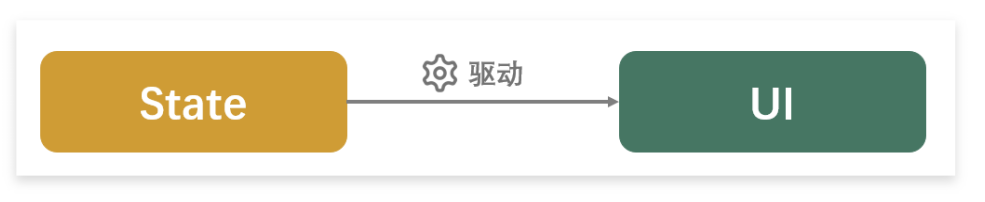
当状态数据改变的时候,界面就会自动更新
组件化
在鸿蒙开发中,组件是构成界⾯的最⼩单元,我们所看到的界⾯,都是由众多组件组合⽽成的,所以编写界⾯其实就是组合组件的过程,ArkTS 提供了很多的内置组件,例如: Text 、 Button 、 Image 等等;并且 ArkTS 还⽀持⾃定义组件,让开发者可根据具体需求⾃定义组件中的内容。
开关灯例子代码
- 在这个例子中 通过改变 isOn 状态来改变图片
@Entry
@Component
struct Light {
  @State isOn: boolean = false;

  build() {
    Column({ space: 20 }) {
      Row() {
        /* 开关 */
        if (!this.isOn) {
          Image('pages/light/imgs/img_dark.png').width(300).height(300)
        } else {
          Image('pages/light/imgs/img_light.png').width(300).height(300)
        }
      }

      Row({ space: 20 }) {
        Button('开灯').onClick(() => {
          this.isOn = true;
        }).width(100)
        Button('关灯').onClick(() => {
          this.isOn = false;
        }).width(100)
      }
    }.height('100%').width('100%').justifyContent(FlexAlign.Center)
  }
}声明组件的完整语法
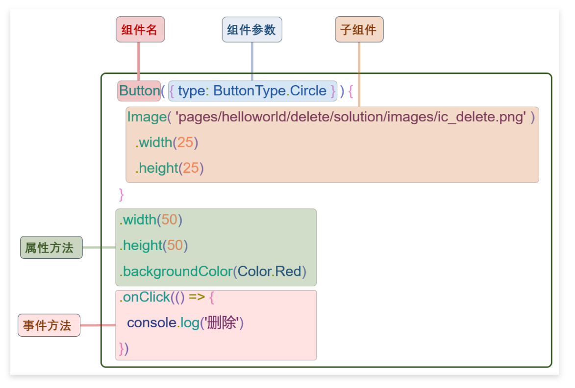
组件参数
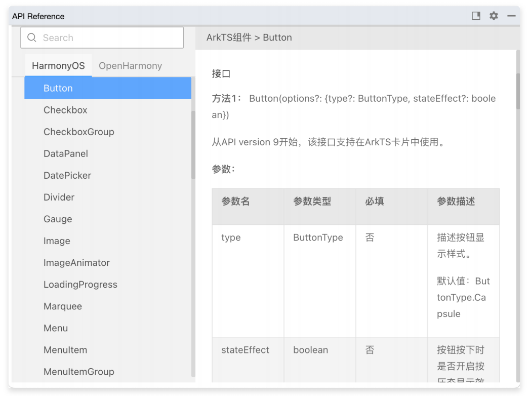
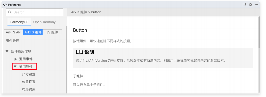
如果组件的定义包含参数,可在组件名称后⾯的 () 中配置相应参数。各组件⽀持的参数,可查看 API ⽂档,查看⽅式如下
- ⾸先将⿏标在相应组件悬停
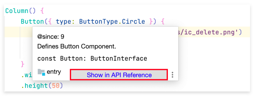
点击 Show in API Reference ,就会弹出 API ⽂档
- 子组件
如果组件支持子组件配置,可在()后的{}添加子组件,若不支持子组件,则不需要{}
- 属性方法
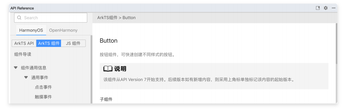
属性方法用于配置组件的样式和其他属性,可以在组件声明的末尾进行链式调用。各组件支持的属性可以查看 API ⽂档
除去每个组件的专有属性,还有各组件都能配置的通用属性,通用属性也可以通过 api 文档查看
- 事件方法
事件方法用于为组件绑定交互事件,可以在组件声明的末尾进行链式调用.各组件的支持事件可以查看 API 文档
除去每隔组件的专有事件,还有各个组件都支持的通用事件,通用事件也可以通过 api 文档查看
自定义组件
除去系统预置的组件外,ArkTs 还支持自定义组件。使用自定义组件,可以使代码的机构更加清晰,并且提高代码的复用性
语法说明
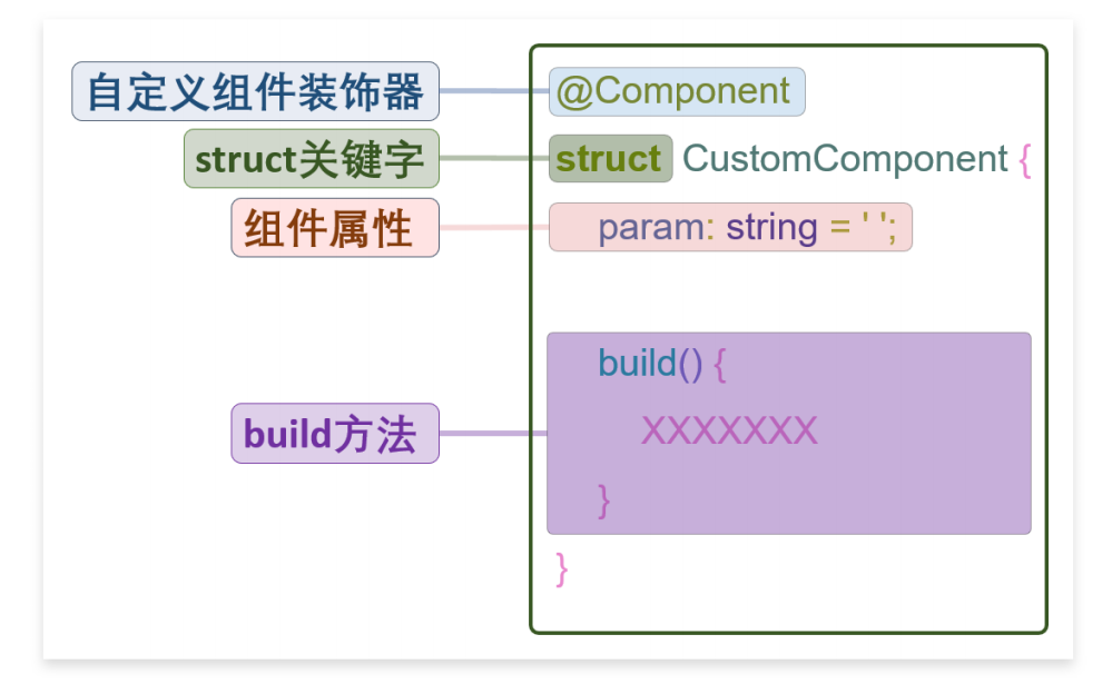
各部分语法说明
- struct 关键字
struct是ArkTs新增的用于自定义组件或者自定义弹窗的关键字.其声明的数据结构和 Ts 的类十分相似。可包含属性和方法
- build 方法
build()方法用于声明自定义组件的 UI 结构
- 组件属性
组件属性可用作自定义组件的参数,使得自定义组件更为通用
@Component装饰器
@Component装饰器用于装饰struct关键字声明的数据结构。struct被@Component装饰后才具备组件化的能力
注意: 装饰器是 TS 一种特殊的语法,用于装饰类,方法,属性,用于修改或者扩展其原有的行为
INFO
在学完自定义组件的语法之后,我们会发现 前文案例中的每个页面实际上都是一个自定义组件
但是和自定义组件的语法相比,前边的案例还多出一个@Entry装饰器,那@Entry的作用是什么呢?
@Entry
在鸿蒙应用中,每个页面都是由一些列组件组合形成的。并且这些组件都逐层嵌套,因此最终形成了一个组件树
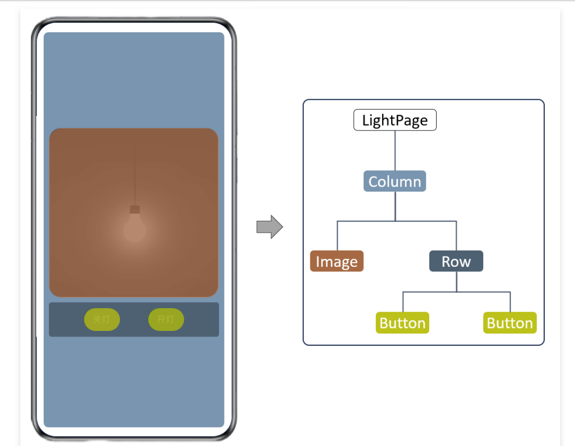
我们前边所编写的每个页面就相当于组件树的根节点,而@Entry装饰器的作用就是标识该组件为组件树的根节点,也就是页面的入口组件
案例赏析
- 自定义组件
新建一个 CustomButton.ets 文件
INFO
图片路径必须是 pages 开头
自定义组件传递参数必须放在 build 的外面
传递参数通过对象来传递 调用的时候必须加上 this,但是他前面不用加@State
@Component
export struct SwitchButton {
  color:Color = Color.Blue;
  build() {
    Button(){
      Image("pages/light/imgs/icon_switch.png")
    }.type(ButtonType.Circle).backgroundColor(this.color).height(45).width(45)
  }
}- 调用的时候
INFO
引入的时候必须写在第一行
调用的地址写相对路径
参数传递必须通过对象传递
import {SwitchButton} from './components/CustomButton'
@Entry
@Component
struct Light {
  @State isOn: boolean = false;

  build() {
    Column({ space: 20 }) {
      Row() {
        /* 开关 */
        if (!this.isOn) {
          Image('pages/light/imgs/img_dark.png').width(300).height(300)
        } else {
          Image('pages/light/imgs/img_light.png').width(300).height(300)
        }
      }

      Row({ space: 20 }) {
        SwitchButton({color:Color.Red}).onClick(()=>{
          this.isOn = false;
        })

        SwitchButton({color:Color.Green}).onClick(()=>{
          this.isOn = true;
        })
      }
    }.height('100%').width('100%').justifyContent(FlexAlign.Center)
  }
}复杂案例
- 两个页面之间相互跳转并传参数
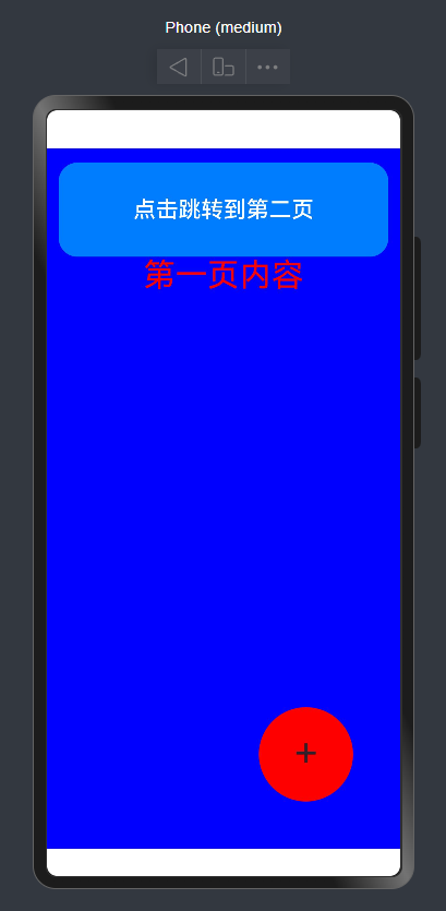
构建第一个页面
import { router } from "@kit.ArkUI"
class DataModelInfo{
  content:string = ""
}
@Entry
@Component
struct Index {
  @State message: string = 'Hello World';
  @State routerparams: string = "";

  gotourl() {
    router.pushUrl({
      url: 'pages/Second',
      params: {
        content: "从首页跳转过来"
      }
    }).then(() => {
      console.log("跳转成功")
    })
  }

  aboutToAppear(): void {
    let params = router.getParams() as DataModelInfo;
    if(params){
      console.log(params.content)
    }

  }

  build() {
    Stack({ alignContent: Alignment.BottomEnd }) {
      Scroll() {
        Column() {
          Button("点击跳转到第二页")
            .type(ButtonType.Normal)
            .width('700lpx')
            .height('200lpx')
            .fontSize('48lpx')
            .borderRadius('40lpx')
            .margin({
              top: '30lpx'
            }).onClick(()=>{
              this.gotourl()
          })
          Text("第一页内容") {
          }.fontSize('68lpx').fontColor('red')
        }
        .justifyContent(FlexAlign.Start)
        .width('100%')
        .height('100%')

      }.width('100%').height('100%').backgroundColor("blue")

      Text("+") {
      }
      .zIndex(100)
      .fontSize("88lpx")
      .width("200lpx")
      .height("200lpx")
      .borderRadius("200lpx")
      .backgroundColor("red")
      .position({
        bottom: "100lpx",
        right: "100lpx"
      })
      .textAlign(TextAlign.Center)
      .lineHeight("100lpx")
    }.width('100%').height('100%')
  }
}
构建第二个页面
import { router } from "@kit.ArkUI"
class DataModelInfo{
  content:string = ""
}
@Entry
@Component
struct Second {
  @State message: string = 'Hello World';
  @State routerparams: string = "";

  gotourl() {
    router.pushUrl({
      url: 'pages/Index',
      params: {
        content: "从第二页跳转到首页"
      }
    }).then(() => {
      console.log("跳转成功")
    })
  }

  aboutToAppear(): void {
    let params = router.getParams() as DataModelInfo;
    if(params){
      console.log(params.content)
    }
  }

  build() {
    Stack({ alignContent: Alignment.BottomEnd }) {
      Scroll() {
        Column() {
          Button("点击跳转到第一页")
            .type(ButtonType.Normal)
            .width('700lpx')
            .height('200lpx')
            .fontSize('48lpx')
            .borderRadius('40lpx')
            .margin({
              top: '30lpx'
            }).onClick(()=>{
              this.gotourl()
          })
          Text("第二页内容") {
          }.fontSize('68lpx').fontColor('red')
        }
        .justifyContent(FlexAlign.Start)
        .width('100%')
        .height('100%')

      }.width('100%').height('100%').backgroundColor("blue")

      Text("+") {
      }
      .zIndex(100)
      .fontSize("88lpx")
      .width("200lpx")
      .height("200lpx")
      .borderRadius("200lpx")
      .backgroundColor("red")
      .position({
        bottom: "100lpx",
        right: "100lpx"
      })
      .textAlign(TextAlign.Center)
      .lineHeight("100lpx")
    }.width('100%').height('100%')
  }
}